> ## Documentation Index
> Fetch the complete documentation index at: https://velt.dev/docs/llms.txt
> Use this file to discover all available pages before exploring further.
# Inline Comments Setup
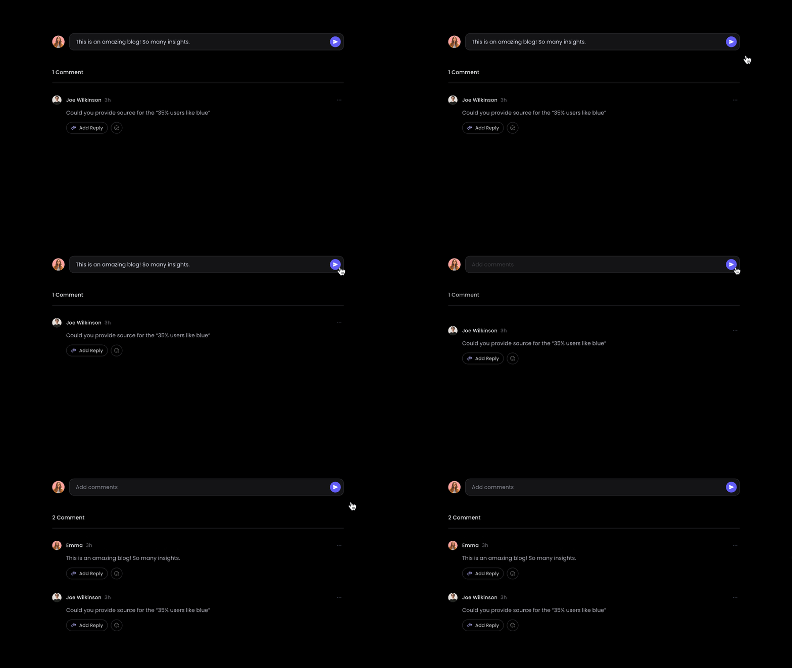 Import the `VeltProvider`, `VeltComments`, and `VeltInlineCommentsSection` component.
```js theme={null}
import { VeltProvider, VeltComments, VeltInlineCommentsSection } from '@veltdev/react';
```
* Add the `VeltComments` component to the root of your app where your `VeltProvider` is.
* This component is required to render comments in your app.
```js theme={null}
```
* Create an element to hold your Inline Comments component, such as a `div` or `section`.
* Add a unique element `id` to it.
```jsx theme={null}
```
* Add `VeltInlineCommentsSection` component inside your container.
* Add `targetElementId` property to the Velt Inline Comments component. This needs to match the id you set to the container. This binds the Inline Comments component with the desired container.
```jsx theme={null}
```
* Default: `true`
* By default inline comment section is multithreaded.
* You can make it single threaded by setting `multiThread` attribute to `false`.
```jsx theme={null}
```
Customize the placeholder text for comment, reply, and composer input fields.
```jsx theme={null}
```
To customize placeholder text shown when **editing** an existing comment or reply, use `editPlaceholder`, `editCommentPlaceholder`, and `editReplyPlaceholder`. See [`VeltInlineCommentsSectionProps`](/api-reference/sdk/models/data-models#veltinlinecommentssectionprops) for details.
* Default: `false`
* Truncate long messages in the list, showing a **Show more** toggle after the specified number of lines.
* Use `messageTruncationLines` to control the cutoff (default: `4`).
```jsx theme={null}
```
* Add the Velt Comments component to the root of your app.
* This component is required to render comments in your app.
```html theme={null}
```
* Create an element to hold your Inline Comments component, such as a `div` or `section`.
* Add a unique element `id` to it.
```html theme={null}
```
* Add `velt-inline-comments-section` component inside your container.
* Add `target-element-id` property to the Velt Inline Comments component. This needs to match the id you set to the container. This binds the Inline Comments component with the desired container.
```jsx theme={null}
```
* Default: `true`
* By default inline comments are multithreaded.
* You can make it single threaded by setting `multi-thread` attribute to `false`.
```html theme={null}
```
Customize the placeholder text for comment, reply, and composer input fields.
```html theme={null}
```
To customize placeholder text shown when **editing** an existing comment or reply, use `edit-placeholder`, `edit-comment-placeholder`, and `edit-reply-placeholder`. See [`VeltInlineCommentsSectionProps`](/api-reference/sdk/models/data-models#veltinlinecommentssectionprops) for details.
* Default: `false`
* Truncate long messages in the list, showing a **Show more** toggle after the specified number of lines.
* Use `message-truncation-lines` to control the cutoff (default: `4`).
```html theme={null}
```
```jsx React / Next.js theme={null}
import { VeltProvider, VeltComments } from '@veltdev/react';
export default function App() {
return (
);
}
```
```html HTML theme={null}
Comment documentation
```
Import the `VeltProvider`, `VeltComments`, and `VeltInlineCommentsSection` component.
```js theme={null}
import { VeltProvider, VeltComments, VeltInlineCommentsSection } from '@veltdev/react';
```
* Add the `VeltComments` component to the root of your app where your `VeltProvider` is.
* This component is required to render comments in your app.
```js theme={null}
```
* Create an element to hold your Inline Comments component, such as a `div` or `section`.
* Add a unique element `id` to it.
```jsx theme={null}
```
* Add `VeltInlineCommentsSection` component inside your container.
* Add `targetElementId` property to the Velt Inline Comments component. This needs to match the id you set to the container. This binds the Inline Comments component with the desired container.
```jsx theme={null}
```
* Default: `true`
* By default inline comment section is multithreaded.
* You can make it single threaded by setting `multiThread` attribute to `false`.
```jsx theme={null}
```
Customize the placeholder text for comment, reply, and composer input fields.
```jsx theme={null}
```
To customize placeholder text shown when **editing** an existing comment or reply, use `editPlaceholder`, `editCommentPlaceholder`, and `editReplyPlaceholder`. See [`VeltInlineCommentsSectionProps`](/api-reference/sdk/models/data-models#veltinlinecommentssectionprops) for details.
* Default: `false`
* Truncate long messages in the list, showing a **Show more** toggle after the specified number of lines.
* Use `messageTruncationLines` to control the cutoff (default: `4`).
```jsx theme={null}
```
* Add the Velt Comments component to the root of your app.
* This component is required to render comments in your app.
```html theme={null}
```
* Create an element to hold your Inline Comments component, such as a `div` or `section`.
* Add a unique element `id` to it.
```html theme={null}
```
* Add `velt-inline-comments-section` component inside your container.
* Add `target-element-id` property to the Velt Inline Comments component. This needs to match the id you set to the container. This binds the Inline Comments component with the desired container.
```jsx theme={null}
```
* Default: `true`
* By default inline comments are multithreaded.
* You can make it single threaded by setting `multi-thread` attribute to `false`.
```html theme={null}
```
Customize the placeholder text for comment, reply, and composer input fields.
```html theme={null}
```
To customize placeholder text shown when **editing** an existing comment or reply, use `edit-placeholder`, `edit-comment-placeholder`, and `edit-reply-placeholder`. See [`VeltInlineCommentsSectionProps`](/api-reference/sdk/models/data-models#veltinlinecommentssectionprops) for details.
* Default: `false`
* Truncate long messages in the list, showing a **Show more** toggle after the specified number of lines.
* Use `message-truncation-lines` to control the cutoff (default: `4`).
```html theme={null}
```
```jsx React / Next.js theme={null}
import { VeltProvider, VeltComments } from '@veltdev/react';
export default function App() {
return (
);
}
```
```html HTML theme={null}
Comment documentation
```