

We recommend that you familiarize yourselves with UI Customization Concepts before attempting to modify any components.
VeltConfirmDialogWireframe
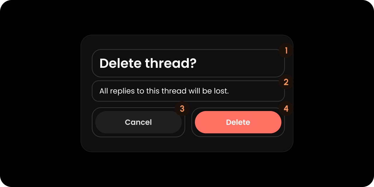
- React / Next.js
- Other Frameworks
Title
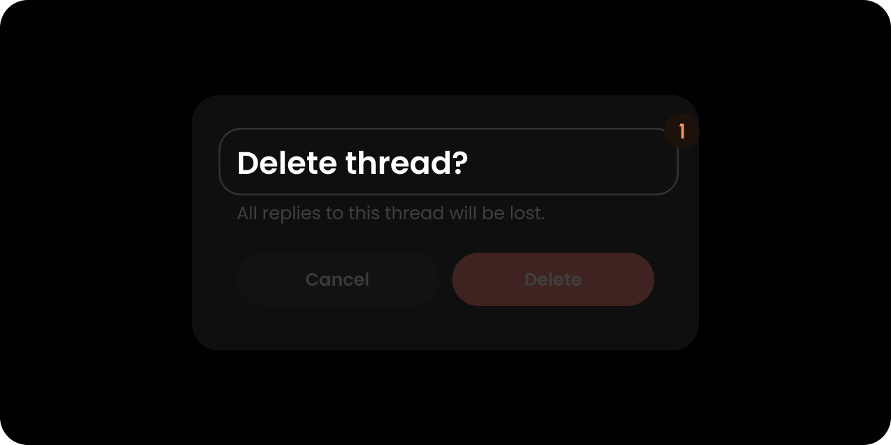
- React / Next.js
- Other Frameworks
Message
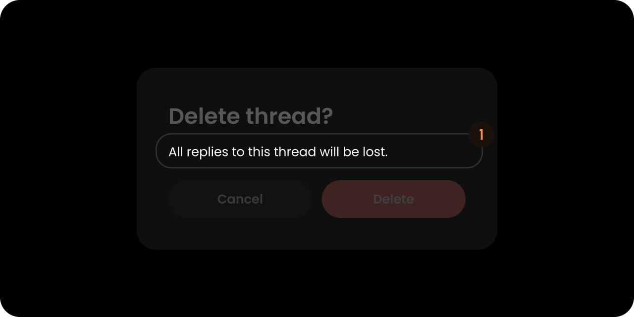
- React / Next.js
- Other Frameworks
Preview
Renders only in the
draftConfirmation popup, where it shows a quoted preview of the unsent draft content. It is empty on every other confirm dialog (comment, area, arrow, tag, and recorder deletes).- React / Next.js
- Other Frameworks
RejectButton
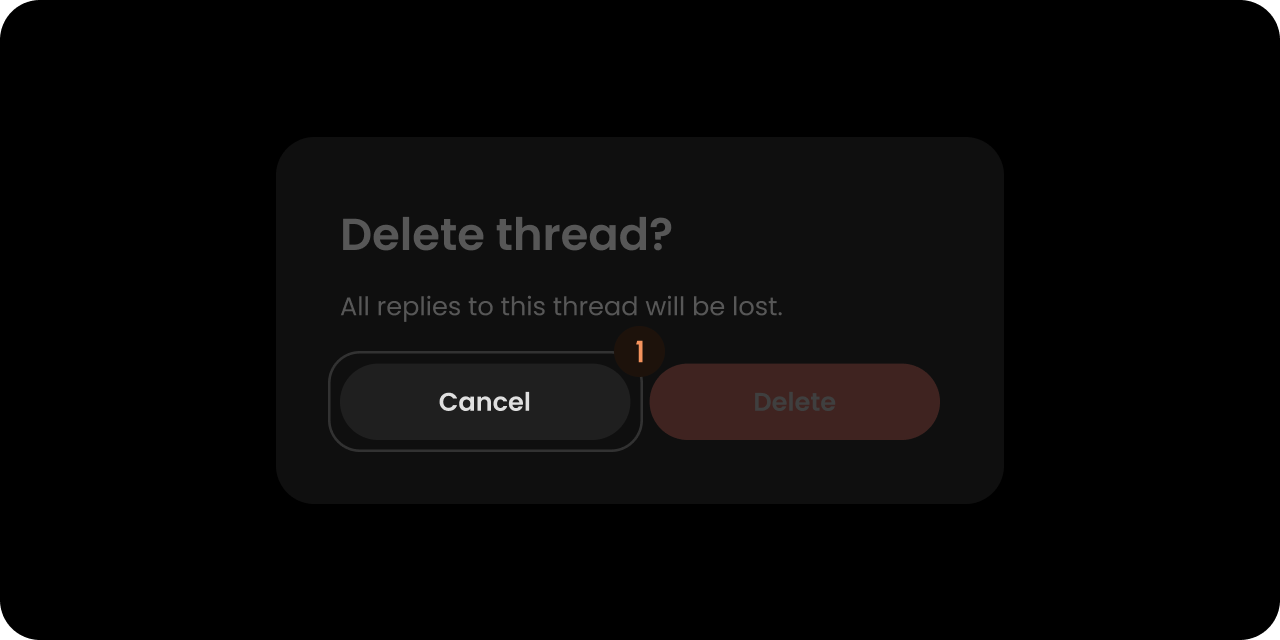
- React / Next.js
- Other Frameworks
ApproveButton
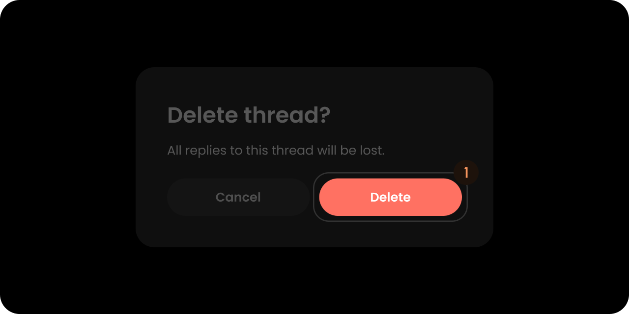
- React / Next.js
- Other Frameworks
Styling
Disable ShadowDOM
ShadowDOM is not used in this component. You can apply your styling directly to the component.Dark Mode
This component takes the dark mode property from the parent feature (e.g., comments) where this is used. If the parent feature component is in dark mode, this component will also be in dark mode.Type-Scoped CSS Classes
When the confirm dialog is shown, a modifier class is added to the root element based on thetype prop (see ConfirmDialogComponentConfig):
velt-confirm-dialog— always present (base class)velt-confirm-dialog--comment— added automatically when deleting a commentvelt-confirm-dialog--reply— added automatically when deleting a replyvelt-confirm-dialog--{type}— general form for any customtypestring (e.g.,archive,mention)velt-confirm-dialog--draft— added automatically when thedraftConfirmationpopup shows- No modifier class is added when
typeis omitted or empty