

We recommend that you familiarize yourself with UI Customization Concepts before attempting to modify any components.
VeltPresenceWireframe

- React / Next.js
- Other Frameworks
AvatarList

- React / Next.js
- Other Frameworks
Item

- React / Next.js
- Other Frameworks
AvatarRemainingCount

- React / Next.js
- Other Frameworks
VeltPresenceTooltipWireframe
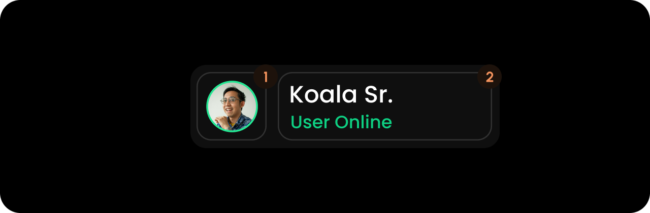
- React / Next.js
- Other Frameworks
Avatar

- React / Next.js
- Other Frameworks
StatusContainer

- React / Next.js
- Other Frameworks
UserName

- React / Next.js
- Other Frameworks
UserActive

- React / Next.js
- Other Frameworks
UserInactive

- React / Next.js
- Other Frameworks
Styling
Disable ShadowDOM
- By default, ShadowDOM is used to ensure that your app’s CSS does not interfere with the styling of the SDK components.
- Disable the shadow dom to apply your custom CSS to the component.
true
- React / Next.js
- Other Frameworks
Limitations
- Anonymous local users never see presence. The feature requires an identified user.
maxUsersdoes double duty: it caps the avatars shown and gates the “+N” overflow badge, which renders only whenfilteredPresenceUsers.length > maxUsers.- A custom
templateneedsshadowDom="true"explicitly if you want it inside the shadow DOM. - Tooltip slots are status-gated:
.UserActiverenders only foronlineand.UserInactiveonly foraway. Neither renders foroffline.