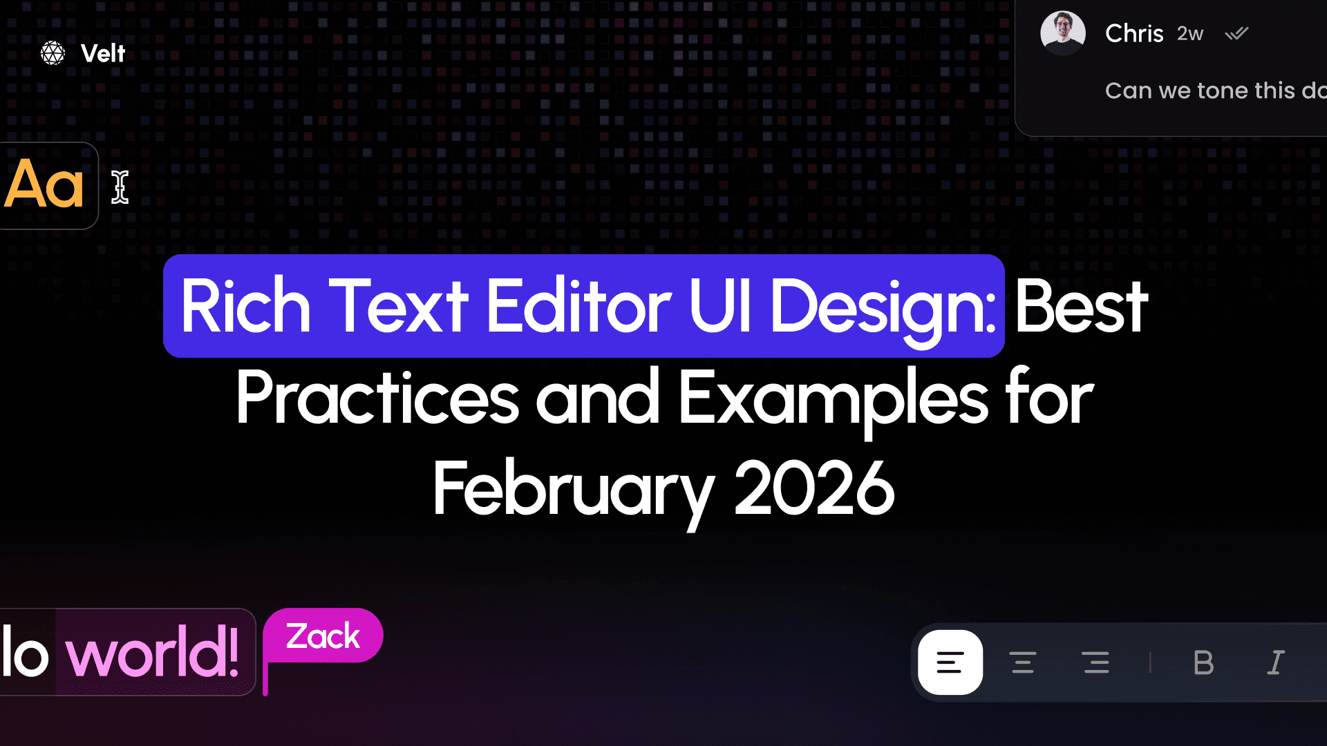
Rich Text Editor UI Design: Best Practices and Examples for February 2026
Learn rich text editor UI design best practices for February 2026. Covers toolbars, responsive design, accessibility, and multiplayer features with examples.
Every multiplayer text editor starts with the same building blocks: somewhere to type, buttons for formatting, and indicators for status. The tricky part is arranging those pieces so keyboard users, screen readers, and mobile browsers all work without separate interfaces. We're covering the structural decisions that keep editors usable across devices and input methods.
TLDR:
- Group toolbar actions by context (text styling, headings, media) with visual separators for faster scanning
- Your editor needs 44×44px touch targets on mobile and logical keyboard navigation with visible focus states
- WYSIWYG interfaces require complex toolbars while markdown editors rely on syntax, choose based on your audience
- Multiplayer editors need color-coded cursors and comment anchoring that tracks content, not fixed positions
- Velt SDK adds real-time collaboration to Tiptap, BlockNote, or CodeMirror editors with pre-built presence and commenting components
Core Components of Rich Text Editor UI Design

Every rich text editor includes the same core pieces, whether you're using Google Docs, Notion, or building something custom. Understanding this structure helps you make smarter design choices.
- The editing canvas. This is where users type and format content. It needs visual breathing room without pushing formatting controls out of reach. Most editors use a white or light background to mimic paper, though dark mode is table stakes now.
- Toolbars. These UI elements contain the formatting controls. You'll see them above the canvas or in a sidebar. Common actions like bold, italic, headings, and lists go here. Some editors use contextual toolbars that appear only when text is selected, reducing clutter during normal typing.
- The menu bar. This handles file operations, advanced formatting, or settings. Simpler editors skip this and rely on keyboard shortcuts or right-click menus instead.
- Status indicators. These show word count, save status, or collaboration data. In multiplayer text editors, this area displays active viewers and editors, creating real-time awareness without overwhelming the canvas.
Now, let's dig into some of those components and look at a few of the best practices that can help make sure the collaborative features in your app provide the best functionality and user experience.
Toolbar Organization and Visual Hierarchy
It may not seem very important, but toolbars play an intrinsic role in the user experience. If users can't find the formatting tools they want, they can quickly become frustrated. Here are some best practices to consider as you think about how your toolbar is visually organized:
- Group formatting actions by context instead of alphabetically. Text styling like bold, italic, and underline should sit together. Headings and paragraph styles form a second cluster. Link insertion and media embedding create a third group.
- Visual separators between groups help users scan faster. A thin vertical line or subtle spacing prevents toolbars from becoming walls of icons. Place frequent actions on the left side where left-to-right readers look first. Save rarely used commands for overflow menus.
- Icon clarity matters more than visual novelty. If your icon requires a tooltip to make sense, add a text label. Contextual toolbars reduce clutter by showing alignment options only when an image is selected or table controls when the cursor sits inside a table cell.
Responsive Design Considerations for Text Editors
Text editors face a harder responsive challenge than most interfaces. You need to preserve dozens of formatting actions while adapting to screens that range from 27-inch displays to 5-inch phones. So, what can you do to make sure that your text editing feature is responsive?
- Start by identifying your editor's core actions. Bold, italic, headings, and lists are non-negotiable. Everything else can move to overflow menus on smaller screens. A three-dot menu icon lets you hide less-frequent options like text color, indentation controls, or table insertion without losing functionality.
- Touch targets need at least 44×44 pixels on mobile. Desktop toolbar icons can sit at 32 pixels, but phone users need more surface area to avoid misclicks. On narrow viewports, you'll need fewer visible buttons.
- Horizontal scrolling breaks the editing experience. If your toolbar extends beyond the viewport width, users lose track of available options. Stack toolbars vertically on tablets or collapse them into a single row with progressive disclosure. Some editors switch to bottom-anchored toolbars on mobile, keeping formatting controls within thumb reach. Test your editor at 320px width to verify users can access basic formatting without hunting through menus.
Accessibility and Keyboard Navigation Best Practices
Keyboard navigation is required, not optional, for users who can't operate a mouse. Every interactive element needs a logical tab order that moves from toolbar to canvas to status area without random jumps. Consider these best practices:
- Focus indicators show where keyboard input lands. Custom focus states should meet 3:1 contrast ratios against the background. Removing focus outlines entirely leaves keyboard users unable to track their position.
- Standard shortcuts like Ctrl+B for bold or Ctrl+K for links reduce learning curves. Document your shortcut list in an accessible location. Inventing novel shortcuts creates friction because power users expect consistent patterns across editors.
- ARIA labels tell screen readers what each button does. A bold button showing a "B" icon needs
aria-label="Bold"to announce properly. Heading dropdowns needaria-expandedstates. The editing canvas requiresrole="textbox"andaria-multiline="true"so assistive tech recognizes it as editable. - Semantic HTML improves compatibility. Use actual
<button>elements instead of styled<div>tags with click handlers. Real buttons work with keyboards automatically and announce correctly to screen readers without extra attributes.
Collaborative Features in Multiplayer Text Editors
Multiplayer text editors display active collaborators through presence indicators that show small avatars in the header or sidebar. Color-coding helps users identify cursors and text selections during simultaneous editing sessions. Here are some best practices to build a great user experience around those collaborative features:
- Live cursors reveal each person's editing position with name labels and user-specific colors. Opacity settings prevent overlapping cursors from hiding text, while auto-fade timers reduce clutter during inactive periods.
- Comment anchoring systems track content relationships instead of fixed positions. When paragraphs get deleted or moved, comments follow the referenced text instead of drifting to incorrect locations.
- Conflict warnings appear when multiple users edit the same paragraph, displaying subtle visual indicators or tooltips that help teams coordinate before overwrites occur.
Design Systems and Component Libraries for Text Editors
Most developers don't build their rich text editor and collaboration features from the ground up. They use existing systems and libraries to make these features available. That's because building editors from scratch consumes months of development time handling edge cases around text selection, formatting state, and undo history. Component libraries solve these problems once, letting you focus on feature differentiation instead of reinventing contentEditable behavior.
Design systems treat text editors as composite components built from smaller primitives like buttons, dropdowns, and popovers. This approach maintains visual consistency when your editor toolbar uses the same button styles as the rest of your app. Customization happens through CSS variables, theme tokens, or component prop overrides. You maintain brand colors, typography, and spacing while inheriting battle-tested editing behavior.
Popular options include Tiptap for headless editors that bring your own UI, ProseMirror for schema-driven editing, and Slate for React-specific implementations. Each library handles the document model and editing logic while exposing styling hooks.
WYSIWYG vs. Markdown Editor Interface Differences
WYSIWYG editors display formatted output as you type. Bravo introduced this concept in 1974, showing text with live formatting instead of markup codes. The interface hides underlying structure, letting users focus on appearance over syntax.
Markdown editors, on the other hand, split the screen or use preview panes. You type plain text with syntax characters, then see formatted output elsewhere. The toolbar shrinks because formatting happens through keyboard symbols, not button clicks. This approach suits developers and writers who prefer keyboard-driven workflows.
WYSIWYG interfaces need complex toolbars because every formatting option requires a button or menu. Markdown editors can skip toolbars entirely, relying on syntax autocomplete or keyboard shortcuts. Some hybrid editors blend both, displaying markdown syntax in real time while preserving the raw text for editing. Here's a look at the two side-by-side.
| Feature | WYSIWYG Editors | Markdown Editors |
|---|---|---|
| Interface Complexity | Complex toolbars with buttons for every formatting option | Minimal or no toolbar, relies on syntax characters |
| Learning Curve | Low - familiar word processor patterns | Medium - requires learning markdown syntax |
| Input Method | Mouse-driven with button clicks | Keyboard-driven with syntax shortcuts |
| Visual Feedback | Real-time formatted output as you type | Plain text with syntax or split preview pane |
| Best For | Non-technical users, content teams, marketing | Developers, writers, technical documentation |
| Version Control | Difficult - stores formatted markup | Easy - plain text compatible with Git |
When should you choose one over the other? 42% of developers use multiple IDEs in their regular workflow, selecting specialized tools for different contexts. Choose WYSIWYG when non-technical users need familiar word processor patterns. Pick markdown when your audience values speed, portability, and version control compatibility.
Common UI Pitfalls and How to Avoid Them
With all of those best practices in mind, as well as a better understanding of the core components of multiplayer text editors, let's look at some of the common UI pitfalls that undermine the user experience:
- Unclear button states. These confuse users who can't tell if formatting is active. When you select bold text, the bold button should visually change to show that state. Use background color changes, icon swaps, or border modifications to indicate active formatting. Without this feedback, users click repeatedly, toggling formatting on and off by accident.
- Icon ambiguity. This forces users to hover and read tooltips for basic actions. A paintbrush icon could mean text highlighting, text color, or background color depending on context. When icons require explanation, pair them with text labels or pick more specific symbols. Testing with users outside your team reveals which icons create confusion.
- Keyboard traps. These lock focus inside the editor without escape routes. Users tab into the canvas but can't tab out to reach other page controls. Always provide Escape key exits or explicit "Done" buttons that return focus to the surrounding interface.
Figma Resources and UI Kits for Rich Text Editors
Thankfully, there are a number of resources to help you create a UI that delights users, not frustrates them.
Figma community libraries, for example, offer pre-built text editor components that can accelerate interface design. Search for "rich text editor," "WYSIWYG editor," or "text editor UI" to find kits with ready-made toolbars, formatting menus, and canvas layouts.
But don't just grab and use. Quality varies across free resources so you need to make sure that whatever resources you are using meet the quality test. For example, check if components use auto-layout for responsive behavior and organized variants for different states. Well-structured kits include hover, active, and disabled button states instead of single static frames.
As for UI kit templates, you should match templates to your feature requirements. Basic editor kits work for simple formatting needs. Apps requiring comments or multiplayer features need kits with those patterns included. Adapt templates by swapping typography and colors to match your design system while keeping spatial relationships intact.
Building Multiplayer Text Editors with Velt
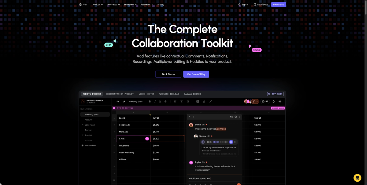
Velt's SDK adds collaborative editing through pre-built components that handle presence, commenting, and real-time synchronization. Drop Velt into existing Tiptap, BlockNote, or CodeMirror editors without building socket infrastructure or permission logic from scratch. The SDK tracks document hierarchy and permissions automatically. Comments anchor to specific text ranges, not fragile coordinates, so annotations follow content through edits and reorganizations. Integration happens through React, Vue, or vanilla JavaScript components. Control styling through CSS to match your design system while Velt handles conflict resolution, presence indicators, and notification delivery.
Final Thoughts on Rich Text Editor Design
The best rich text editor UI design balances visual simplicity with powerful formatting options, giving users quick access to the tools they need without cluttering the canvas. Whether you choose WYSIWYG or markdown, your interface needs responsive toolbars and solid keyboard support. Start with your core use case, then layer in collaboration features as your product grows. Book a demo to see how Velt adds multiplayer editing to your existing editor setup.
FAQ
How do I make my text editor toolbar work on mobile without horizontal scrolling?
Keep core actions like bold, italic, and headings in the visible toolbar, then move less-frequent formatting options into a three-dot overflow menu. Keep touch targets at 44×44 pixels minimum and test at 320px width to verify all basic formatting remains accessible.
What's the difference between WYSIWYG and Markdown editor interfaces?
WYSIWYG editors show formatted output as you type and need toolbars for every formatting action, while Markdown editors let you type plain text with syntax characters and use fewer or no toolbar buttons. Pick WYSIWYG for non-technical users who expect familiar word processor patterns, or Markdown when your audience values keyboard-driven workflows.
Can I build a multiplayer text editor without custom socket infrastructure?
Yes. Velt's SDK drops into existing editors like Tiptap or BlockNote and handles presence indicators, real-time synchronization, and permission logic automatically. Comments anchor to text ranges instead of fixed coordinates, so annotations stay attached to content through edits.
Why do keyboard users need visible focus indicators in text editors?
Focus indicators show where keyboard input will land when users tab through toolbars and canvas areas. Without visible focus states that meet 3:1 contrast ratios, keyboard users can't track their position in the interface and may lose their place or miss interactive elements entirely.
What makes a good collaborative cursor implementation?
Color-code each user's cursor with name labels and use opacity settings to prevent overlapping cursors from hiding text underneath. Add auto-fade timers to reduce visual clutter when collaborators pause typing and keep cursor positions tied to document structure instead of pixel coordinates.